Some designs just stop you in your tracks, and these Pinterest finds are no exception. They bring together two of the most impactful (yet often underappreciated) design elements: accent trim and wallpaper. These spaces showcase how thoughtful details, and a pop of color can transform ordinary corners into showstoppers. Let’s take a closer look at what makes each of these designs so stunning.
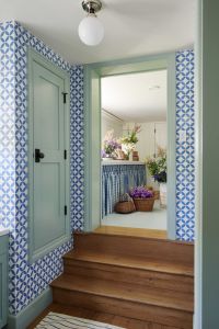
1. Blue Geometric Wallpaper with Matching Trim
The bold, blue geometric wallpaper in this design makes an undeniable statement. Paired with perfectly matched trim in a soft blue-green hue, the entire space feels cohesive and intentional. The trim doesn’t just frame the room; it amplifies the wallpaper’s impact, creating a seamless flow from wall to woodwork.
What Makes It Work:
- The repetition of blue tones ties the room together, creating a unified aesthetic.
- The simplicity of the trim’s design allows the wallpaper to shine without competition.
Where to Use This Look: This pairing is perfect for smaller spaces like entryways, mudrooms, or hallways, where a bold pattern can pack a punch without overwhelming the room.
2. Whimsical Pattern with Sage Green Trim
This design takes a whimsical wallpaper pattern and balances it with earthy sage green trim. The botanical motifs in the wallpaper are playful and fresh, while the green trim grounds the design, giving it a polished yet approachable vibe. And that pop of coral on the ceiling is just the cherry on top!
What Makes It Work:
- The trim color is pulled directly from the wallpaper’s palette, creating harmony between the elements.
- The use of a darker, solid color on the trim adds depth and dimension to the lighter, more intricate wallpaper.
Where to Use This Look: Ideal for staircases or landings, this pairing brings a bit of personality to transitional spaces that often get overlooked.

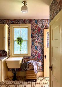
3. Vintage Floral Explosion
This floral wallpaper is unapologetically bold (exactly the way I like my design inspo), and the soft yellow trim is the perfect complement. The vintage-inspired blooms bring a sense of nostalgia and charm, while the trim provides just enough contrast to keep the design from feeling too busy.
What Makes It Work:
- The neutral-toned yellow trim adds warmth and helps balance the wallpaper’s vibrant pattern.
- The overall palette feels intentional, with the trim subtly echoing the lighter tones in the floral design.
Where to Use This Look: This combination is perfect for utility spaces like laundry rooms and bathrooms, where you can have fun with design while keeping things functional.
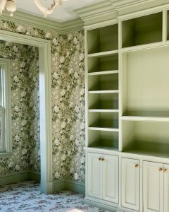
4. Sage Green Built-Ins with Coordinating Wallpaper
Here, the wallpaper’s delicate floral design is mirrored by custom built-ins painted in a soft sage green. This creates a layered look that’s both cohesive and so full of character. The matching trim on the built-ins and windows ties everything together perfectly!
What Makes It Work:
- The matching trim and built-ins make the space feel cohesive and curated.
- The wallpaper’s pattern adds texture without competing with the architectural details.
Where to Use This Look: Perfect for libraries, home offices, or reading nooks, this combination exudes a sense of traditional sophistication.
5. Moody Blues with Matching Doors and Trim
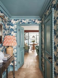
And now, the pièce de résistance: this breathtaking hallway. The moment I saw it, I instantly turned into the heart-eyes emoji. The wallpaper’s blue floral motif is elevated by this playful trim and doors painted in a moody, coordinating blue. This monochromatic approach strikes the perfect balance of bold and cohesive, creating a space that feels both cozy and enveloping.
What Makes It Work:
- The monochromatic palette creates a high-impact look without feeling chaotic.
- Painting the doors the same color as the trim gives us more depth and cohesion.
Where to Use This Look: This design is ideal for hallways, powder rooms, or even guest rooms, where you can lean into the drama.
Why Accent Trim and Wallpaper Work So Well Together
Accent trim and wallpaper are the ultimate design dream team. Wallpaper delivers pattern, color, and personality, while trim adds structure and refinement. Together, they create spaces that feel intentional, full of character, and just uniquely yours. These elements are perfect for giving your home that playful, charming look. Whether you opt for bold geometric patterns, whimsical botanicals, or nostalgic vintage florals, this pairing is a guaranteed way to elevate your space.
Which of these looks speaks to you? Let me know in the comments, and don’t forget to check out more posts at the link HERE for more design inspiration!
Thanks for being here today!